

We see a lot of MSP websites. Here are the 10 that impressed us most this past year.
You never get a second chance to make a first impression, and for many potential clients, that critical first impression is going to come from your website.
If the thought of that leaves you feeling less than confident you’re not alone. We’ve spoken with many MSPs considering a website revamp this year. Maybe, like them, your goal is to make your site more reflective of who you are and a stronger magnet for new leads. And maybe you’re looking for inspiration. Well, you’ve come to the right place!
Just note: As you’ll see, the very best websites are distinct extensions of their company’s brand. They stand out because they capture what makes the companies they represent different. So, while they can certainly inspire, the very best thing you can pull from them is the smart decision to go your own way and figure out what “staying true to your brand” means for you, too.
With that said, I recently sat down with designer and brand strategist Claire Jenks to share our “Top 10” list of MSP websites, and get her help digging into what sets these examples apart. The resulting tear downs shed light on what these sites do extremely well, things that could potentially be improved, and takeaways that can help you level-up your own piece of Internet real estate.
You can watch us review all 10 websites, back-to-back in the video here:
Or, if you’re short on time, you can skip around and read quick takeaways for each website below:
The 10 Best MSP Website Examples 2019
- #10: TechMD
- #9: Hilltop Consultants
- #8: Valiant
- #7: Veterinary IT Support
- #6: Astaris
- #5: Dedicated IT
- #4: Medicus IT
- #3: Accent
- #2: Exosource
- #1: Nucleus
A quick note on our methodology
So, how did we choose our 10 “best” websites? We’ll be frank — the exercise was absolutely subjective. But we did try to give our subjectivity some structure. For starters, we kicked off our search for the best MSP websites by reviewing every company on ChannelE2E’s Top 100 Vertical Market MSPs list for 2019. From there, we extended the search to consider companies we’ve seen actively mentioned in “great website” discussions and threads (like this one).
When reviewing each site, we took five basic criteria into account:
- Layout: Is the site well organized? Is it easy to navigate? Most importantly, does it provide visitors with the right info up front and a clear path for what to do next?
- Imagery: Are they using high-quality images and videos and avoiding stock images?
- Copy: Is the messaging clear and compelling?
- Content: Do they have engaging and regularly updated content?
- Branding: How cohesive and aligned is the branding? Does the site convey a unified story and tone?
In addition, we also gauged websites on two more important factors:
- How reputable does it make the MSP appear?
- How personable does it make the MSP appear?
That last one in particular plays a more crucial role in the buying (and renewal) decision than you might think.
What the best MSP websites have in common
Along the way, we discovered that a select group of companies were clearly approaching things differently, and as a result, their websites really stand out.
While the vast majority of MSP websites are used simply to provide a list of services offered, contact information, and little else, exceptional MSP websites are built to do much more. They signal to specific visitors that they’ve landed in the right place. They anticipate those visitors’ questions, and they answer them in clear and compelling ways that guide them through next steps. They make an impression. They build trust.
And in nearly every case, they realize that less is more.
It got us thinking of Maslow’s Hierarchy of Needs, and inspired to create our own take on it below:
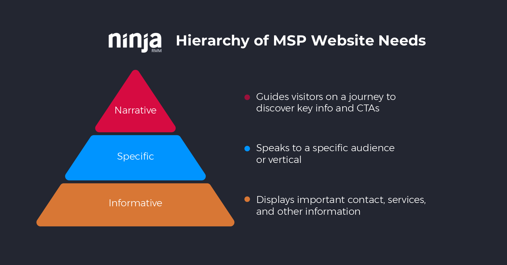
At a bare minimum, a MSP website obviously needs to have basic info on what the company provides and how to get in touch with them. But once that’s established, gearing the site to speak to a specific audience’s distinct priorities, challenges, interests is the first step in separating it from every other MSP website online. The very best sites do both of those things, but take it up a notch by delivering it all in an engaging narrative.
Want to see what we mean? Let’s dive into this year’s list.
#10: TechMD
Site: https://www.techmd.com/
Tagline: “We do IT right”
Built with: Bootstrap, WordPress
First reactions: Things they’re doing well ?
- Professional look and feel: The background hero video does a nice job of instantly conveying reputability. The fact that it’s high quality and professionally shot really adds to that. I love that it’s not generic footage, too. One of the primary jobs of an MSP website is to show visitors that the company is the real deal and legitimate. Right away, we see here there’s a real office. It’s nice! There are real people working here. They look nice, too!
- Cohesive branding: They’re keeping their colors and fonts consistent and integrated throughout the site.
- Nice use of social proof: Putting their awards front and center is a great move, and I love that they’re including the “Best Places to Work” badges. Customers want to work with companies where there’s a good culture and employees are happy and well taken care of.
Things they could potentially work on ?
- Who are they for? Would have liked to see them make it more clear exactly who their target audience is and strike a few chords by highlighting their specific pains points and challenges.
- Big blocks of tiny text: The tendency is to pack service descriptions with messaging points and keywords, but when the majority of people see a big block of text they skip right past it. Content needs to be skimmable, and the best way to test that as you’re writing your own web copy is to see what it looks like on a mobile phone. In short, they could benefit from being more concise (says the guy who writes 2,000-word blog posts).
One big takeaway for MSPs
Book a videographer for a day and squeeze as much content as you can from them.
The thing I love most about TechMD’s site is their terrific use of video. Their site is jam-packed with it. My guess was they had booked a professional videographer to come in a shoot a bunch of different footage all in one day — the office b-roll for the hero video, the interviews with their CEO, and maybe even the “One-Minute Wednesday” videos. But it actually looks like One-Minute Wednesdays and the video summaries they add to some of their blog posts are created by Drew Larson, their in-house marketing communications manager (nice work, Drew!).
You may not have a Drew, but don’t let that stop you. See how much you can hire a videographer for a day, then make the most out of that investment by getting them to shoot a whole series of videos. It does take planning in advance, but if you put together a list of topics and prep yourself and/or members of your team, you can end up with an entire series of short 1-2 minute videos that all have the same great professional look and feel. You could even try to coincide the shoot with a visit from a customer to get a testimonial recorded, too.
Smaller shop? Don’t have a stunning office made for beautiful b-roll (yet)? There are still plenty of good things you can do to achieve the same effect these videos are having — showing that you’re reputable and personable. We’ll cover those as we look at some of our other website examples.
#9: Hilltop Consultants
Site: http://www.hilltopconsultants.com/
Tagline: “IT experts. Legal focused.”
Built with: Bootstrap, Joomla
First reactions: Things they’re doing well ?
- Clean and spacious: Nice to see the restraint holding back from adding too much copy. As a result, the site has a lot of nice whitespace and it feels very clean and accessible.
- Clear verticals: If you do specialize in a particular industry, it’s always good to make that clear right up front so those people can know they’ve landed in the right place.
- Distinct, cohesive branding: Love the orange.
Things they could potentially work on ?
- Highlighting their differentiators: They’ve got their checklist of what they offer, but they could really be taking better advantage of it to highlight what they have that others don’t, specifically re: their vertical-specific offerings and expertise.
- Paying more attention to their “Insights” page: Small potatoes, really, but I’m not a fan of them including their tweets in their insights/content section where you expect to see blog posts. There are even a few where they’re tweeting at other vendors re: issues and they may not want visitors to actually see those.
One big takeaway for MSPs
Make your logo iconic.
That H. It’s so simple, yet it’s distinct. It stands out. It’s iconic. It permeates everything they do, and everything they do is distinctive because of it. How does your logo match up? Too often we see logos that are simply the name of the company in a decorative font. Others go to the other extreme and try to do too much. Hilltop’s “H” fits everywhere and is another good example of the power of simplicity.
#8: Valiant
Site: https://thevaliantway.com/
Tagline: “Protect and grow your business The Valiant Way”
Built with: Bootstrap, WordPress
First reactions: Things they’re doing well ?
- Strong sense of expertise: They’ve clearly put a lot of thought into their processes and approach (they even have their own philosophy). It makes them come across as very reputable, and the logo, fonts, and imagery adds to that, too.
- Nice use of content and tool assets: There’s a downtime calculator, shadow IT checklist, phishing whitepaper, and more. In addition to a very active blog. All of which adds to the perception that they’re knowledgable experts.
Things they could potentially work on ?
- Where are the people? I’d love to see more of the people behind the company and a clearer sense of who their ideal customers are, showing that Valiant is personable in addition to being reputable.
One big takeaway for MSPs
CTAs for days.
The best websites guide the visitor journey by always making it extremely clear what to do next. Valiant directs you at every opportunity with clear, effective CTAs. Nearly every single text block concludes with a link to learn more or do something next.
#7 Veterinary IT Support
Site: https://www.veterinaryitsupport.com/
Tagline: “Award-winning Veterinary IT Support”
Built with: WordPress
Note: Veterinary IT Support’s website was updated sometime after we made our list and the video. Our teardown refers to the previous version.
First reactions: Things they’re doing well ?
- Completely tailored to their audience: They couldn’t get any more clear who their services are for if they tried. It’s infused into every part of the site. The copy, the imagery, and, of course, the company name, itself.
- Clear, concise copy: They provide just the right amount of info that their non-techy audience requires, nothing more.
- Good use of a content lead magnet: Downloading the Free IT Wellness Guide is a nice next step alternative for visitors not quite ready to hop on the phone.
Things they could potentially work on ?
- Ditch the stock photos: They still work to some degree thanks to the focus on animals, but it would be even better to have real photos of the company and customers.
One big takeaway for MSPs
Make your clients the stars.
Especially if you specialize in a vertical. Those prospects should know the second they land on the page that your service is specifically for them.
#6 Astaris
Site: https://astaris.co.uk/
Tagline: “IT support for the hospitality trade”
Built with: WordPress
First reactions: Things they’re doing well ?
- Distinct look and feel: They’ve got a bold, vibrant look that matches their target vertical (hospitality) perfectly.
- Loud and clear messaging: Much of the copy on the site provides an effective 1-2 punch, showing they know what their clients’ biggest pain points and challenges are, and answering them with value props that hit home with this audience. Ex: “Your tills crashing at 9pm on a Friday night with a queue five deep at the bar would be a disaster. We provide IT solutions specifically designed for the hospitality industry that minimise the risk of this happening….we work with you at your pace and your hours.”
Things they could potentially work on ?
- Make copy more skimmable: Here we see that “big blocks, tiny text” problem surfacing again. I’d like to see text broken up, reduced, and made larger. As is, some chunks of text feel like a chore to read.
One big takeaway for MSPs
Align your brand and tone with your target clients.
Rather than try to be a bit of everything for everyone, Astaris has picked their lane and gone full speed ahead. As a result, their site is much more likely to strike a chord with prospects and establish a connection. It enables them to walk into competitive situations clearly positioned as the provider who knows the client’s industry inside and out.
The lesson: Don’t be content with looking like every other MSP out there. Take your cue from your ideal customers, instead. If they’re bold, be bold.
#5: Dedicated IT
Site: https://www.dedicatedit.com
Tagline: “At the end of the day, it’s about getting things done”
Built with: Bootstrap
First reactions: Things they’re doing well ?
- Packed with character: The site has a vibrant feel with great tone and energy that manages to convey professionalism with a hefty dose of personality at the same time. It’s the cumulative result of many things — from the punchy, value-based copy to the imagery (stock photos, but for the most part distinct, high quality ones that really add to the vibe) to small touches like the batman mask icon that make a big difference.
- Comprehensiveness: The site also conveys the sense clients will be fully covered working with the company. There’s a ton of info here, from the service-specific detail to the industry-specific pages. In fact, it may almost be a little too much.
Things they could potentially work on ?
- Dial it back a bit: There’s so much going on here that, as a visitor, I’m not completely sure where to start or what to do next. I’d love to see a more direct path for visitors. And I’d love to see slightly fewer design/layout elements. You get the feeling that in their fun, they wanted to use all the toys in the toy box. Being a little more selective and distilling things down could help make the site a bit more cohesive. Less can typically be more.
One big takeaway for MSPs
Don’t be afraid to have a personality.
Beyond showing that with copy and imagery, another big part of it is being direct and up front with what you care about. Dedicated IT does a great job of quickly explaining not just what they do, but why they do it. As a result, it’s clear there’s a team of real people behind the dials here who have passion, integrity, and who’d likely be a whole lot of fun to work with.
One of the reasons is it’s clear that they are having fun. People are drawn to that.
#4: Medicus IT
Site: https://medicusit.com/
Tagline: “We do IT right”
Built with: WordPress
First reactions: Things they’re doing well ?
- Clear, compelling CTAs: There are a few generic “Learn more” buttons, but their primary CTAs are more specifically directive and enticing. Ex: “Make sure you’re compliant.”
- Good use of company-specific content and social proof: Like TechMD, they’ve gone to the trouble of using footage of their office and their team as a background hero video. The quality isn’t quite on the same level, but the effect is the same — they’re a real business with real people who want to work with you.
- Bonus points for the Windows 7 EOL countdown: I’ve seen quite a few MSPs doing this, and it really is a great example of using content to spark interest and create urgency.
Things they could potentially work on ?
- Give sub-pages some more love: Considering how good the homepage is, the services-specific sub-pages the homepage directs to are a bit of a let-down. It’s kind of like they’ve gone to the trouble of making a great restaurant front, but when you walk inside it doesn’t quite match your expectations. I’d love to see a little more meat on those bones.
- Branding could use updating: The branding is consistent, but they could consider making it a bit more distinctive and perhaps even take a page from Veterinary IT Services by leaning even more into the medical theme.
One big takeaway for MSPs
Show you’re aligned with your clients’ priorities.
That can go beyond referencing their specific pain points and challenges to include you share the same values as them, too. One thing you won’t see visiting the site today is during October they adopted a pink homepage theme and specific messaging highlighting their support of Breast Cancer Awareness Month. That showed a great alignment with their target audience.
In a competitive market where it’s increasingly difficult to differentiate based on services, making the prospect feel like there’s common ground and a connection with your mission and values can sometimes make all the difference.
#3: Accent
Site: https://www.accentonit.com/
Tagline: “Fast. Friendly. Frustration-Free.”
Built with: Ruby on Rails, Anchor CMS
First reactions: Things they’re doing well ?
- 100% clear who they’re for: I love how they come right out and state they’re specifically for Southern California businesses with 40-500 employees.
- Segmentation based on buyer personas: I also love it when it’s clear a company is really embracing the power of buyer peronas to surface and speak to their target audience’s pain points and priorities. This is clearly on display in Accent’s “Do You Struggle with IT Challenges Like” section (something every MSP should consider taking a cue from) as well as their “Why Southern California Professionals Choose Accent” section which highlights different value props for three different types of individuals they work with.
- Highlighting the success new customers can expect: Other MSPs should also take note of how Accent lays out in detail what the first 45 days of working with them looks like with their IT Results Cycle. It underscores how organized and process-driven they are, and their terrific “Typical IT Experience” stats allow their results to speak for themselves.
- The content game is strong with this one: Accent is utilizing content marketing as well as any MSP I’ve seen. In addition to an active blog and webinar program they have multiple content downloads they’re using as lead magnets, and on top of it all they also have ungated webpage versions of their downloads — what inbound marketing pros refer to as pillar pages — designed to soak up search traffic and convert visitors by encouraging them to download the PDF (see their Guide to IT Support Services as an example). It’s no surprise they have a Director of Marketing at the helm of all this, but you don’t necessarily have to have your marketer on staff to try out maybe one or two of the many things they’re doing.
Things they could potentially work on ?
- Their branding could use an update: With all the fantastic things they’re doing, it’s a little surprising to see them packaging it all with low-quality imagery and branding that feels a bit outdated. I would love to see them get a good glow-up — revamp the logo, level-up the imagery, maybe even change color schemes — so that their look is on the same level as everything else that’s so great about them. As is, I think it’s unfortunately selling them short.
One big takeaway for MSPs
Lead with pain points and leverage content.
Most MSP websites put all the focus on describing their services. One of the reasons Accent stands out is that they put equal focus on listing client challenges. That can seem like a small thing, but the truth is putting pain points in clients’ own words is an extremely powerful way to immediately resonate with them and make it clear you’re a provider who actually gets them and appreciates where they’re coming from.
In terms of leveraging content, one thing the majority of the most successful MSPs do well is provide content downloads as a pressure-free alternative for prospects who are interested, but who just aren’t ready yet to hop on a sales call. Visitors come to your site under all sorts of contexts and various stages of “ready.” Having the right content offer can help you give visitors another productive option that sets the stage for future nurturing and touchpoints, so visiting your site isn’t an all-or-nothing experience.
#2: Exosource
Site: https://msp.exosource.com/
Tagline: “All-in-one IT department for your SME”
Built with: Bootstrap, WordPress
First reactions: Things they’re doing well ?
- Memorably distinct: Whereas the majority of MSP websites utilize the same cookie-cutter templates, the team at Exosource never has to worry that their site looks like a competitor’s. For starters, I don’t see many MSPs going the one-page design route, and of course the illustrations set them apart even further.
- Clean layout, laser-focused copy, dead simple navigation: Speaking of the one-page design, it makes navigating the site incredibly easy (aside from some annoying stickiness), and carries the additional benefit of being able to present visitors with a very clear and deliberate path of discovery. The site essentially anticipates the major questions visitors will have — “What do you do? How do you do it? What’s the value? What are next steps?” — and is able to walk visitors down the page, providing clear, concise answers for each.
- Embracing the idea that less is more: The one-page design also provides some helpful constraints, forcing Exosource to keep copy short. Many MSP websites quickly become cluttered, but thanks to the use of slideshows, Exosource is able to let their copy breathe while still managing to cover a lot of info.
- Everything signals “easy to work with”: From the illustration style to the straight-forward navigation to the pricing calculator that makes it simple to estimate cost — the site has been thoughtfully built to position Exosource as the perfect answer for small businesses who want working with an IT services provider to be easy and hassle-free.
Things they could potentially work on ?
- Would love to see social proof: While I think the minimalist approach definitely works in their favor, I’m a little surprised there’s no social proof in the form of testimonials or results.
- Little things: As mentioned, scrolling through the slideshow can be a little frustrating, at least when using a trackpad. I found it skipping over entries two at a time. Seems like it there might be an easy fix there, and that goes for my next small nit-pick, too. Despite all the attention paid to the branding and design, the Exosource logo on the homepage looks like it’s lo-res. Not a big deal, but because the rest of the page looks so great it’s definitely noticeable.
One big takeaway for MSPs
Put yourself in the mindset of your prospects (and keep it simple).
While the illustrations may get a lot of the credit for making the site so distinct and personable, I actually think the layout’s clear, directive flow is the secret sauce of this website. After all, the site doesn’t just look cool, it moves visitors from point A (who are these guys and what exactly do they do?) to point B (we should get in touch with them to learn more) extremely effectively and economically.
In many cases, an MSP website’s primary job isn’t to bombard visitors with info. It’s to convince them to pick up the phone or fill out a contact form. That’s it.
Exosource’s site is a testament to the power of keeping things simple and staying laser focused on that task. Don’t overcomplicate things. Address the natural questions visitors need to have answered before they’re ready to be contacted, then get out of your own way.
#1: Nucleus
Site: https://yournucleus.ca/
Tagline: “Managed IT Services that make things better”
Built with: WordPress
First reactions: Things they’re doing well ?
- Loads of personality: I don’t think there’s any other MSP website that looks quite like this. The hand-drawn illustrations and typography make a powerful first impression that manages to be distinct, personable, authoritative, and approachable all at the same time. Like the Exosource site, it’s a testament to how much character and likeability the right illustration style can instill in your brand.
- Hard sell in a soft package: Don’t let the friendly sketches fool you, though. This site may be charming, but it’s also sneakily merciless in its takedown of the competition. “We’re better than other MSPs” is essentially the core message here (see “Standard MSPs vs. The Nucleus Way” on the homepage and the comparison checklist on the About page). In fact, the word “better” appears 13 times on the homepage alone. It’s really easy for that type of approach to come across as cocky and/or trying too hard, but it flies here, in large part because it’s balanced by the site being just so darn endearing.
- Controlling the narrative: Before we move on, let’s linger on that side-by-side comparison and chart a little longer. I’m honestly surprised I don’t see more MSPs doing something similar. I love that Nucleus doesn’t shy away from acknowledging that visitors are going to compare them to other MSPs. Instead, they encourage the comparison, and jump at the chance to be the ones establishing the comparison criteria and controlling the narrative.
- Big on character, lots of heart: In addition to running a thriving MSP, the team behind Nucleus also manages Tech for Kids, a non-profit dedicated to supplying refurbished computers to schools across Canada. Having a dedicated page calling attention to the non-profit is another great way of showcasing the company’s character and values.
Things they could potentially work on ?
- Where are the results? My only major suggestion for the company is to reconsider how they’re handling their “Results” page. When I hear “results” I expect to see numbers. Instead, what I find is a collection of case studies, which are quite short and don’t have much in terms of numbers, either. What each entry does have is a fantastic testimonial quote, but unfortunately those are buried unless you click through to each one. I’d love to see Nucleus surface those more by transforming this page from a collection of “case studies” into a collection of testimonials. Replace the descriptions with the quotes, and keep the links for visitors interested in learning more. This is also one area where I think the otherwise fantastic branding design might be a little too constraining. Having Slack as a satisfied customer is absolutely HUGE, but by displaying their logo like this instead of with the colors we’re all used to seeing makes it easy to miss.
One big takeaway for MSPs
Be bold, be memorable, and tell a crystal-clear story.
In a crowded MSP market where differentiation is increasingly hard to come by, thanks to their website, Nucleus truly stands out. This is going to sound ironic coming from a piece titled “Best MSP Websites,” but I think one of the big lessons here is MSPs shouldn’t just copy what other MSPs are doing. Know your audience. Look outside the MSP space to see what other companies catering to your audience are doing. Draw inspiration, but don’t be afraid to do your own thing.
Also, keep in mind that while distinct branding can capture initial interest, it’s up to compelling copy and storytelling to convert visitors. Nucleus excels here, too, by making prospects the hero and convincing them “better” is possible.


